Thursday 16 December 2010

What I Learnt From My Audience Feedback

As a class, we conducted a task where we was able to analysis each others music publications, in order to see what worked successfully and what didn't. I learnt alot from this and released that some of my intentions were not met.

Two main points I learnt were:
  •  I did not reach my target audience successfully, which therefore lead to me not meeting my intention of reducing gender inequality. 
  • The genre of music was not clear enough.
I learnt in order to improve this, portray gender equality, allowing my magazine to stand out appealing to both genders. To do this, I could have used images of both genders and colours which appeal to the male population. To improve upon the genre being clear, I could have gave away a music CD, instead of a dance. I could have used microphones and such in my images.

Despite the negative points, I also had some positive feedback. Out of 3 people, 2 correctly identified my genre of music publication and they identified it by how I intended to, for example, masthead and colours. The female target audience was also identified correctly through use of image which is what I chose. I feel despite the negative points, my magazine was still successful.

Audience feedback was useful and I have learnt from it so in future when I design and make a publication, I know how to reach out to my target audience successfully. I could also talk to my audience before making the publication and see how they would portray an audience or a genre to gain knowledge which will also of lead to a higher standard, more successful music publication. This is an element I could use in future publications, not only magazines but websites, films, etc.

Audience Feedback

Evaluation Question 7) Looking Back At Your Preliminary Task, Of Designing The Front Page Of A School Magazine, What Do You Feel You Have Learnt In The Progression From It To The Final Product?

I have learnt alot in the whole task, including prelim. In the prelim task I learnt basic Photoshop and photography skills, these were expanded on when designing and making the full product. I learnt how to develop skills and most importantly, how to analysis work that I have created, choose the best and worst elements and improve upon them. To lead me from my prelim task into my main music task, I started with a planning for production.

The start of the progression from prelim to main task I evaluated my prelim front cover and contents, I looked at the positive aspects as well as the negatives and despite the content being of different issues, conveying from school to music, I will still able to use elements, this is something I learnt. I learnt how to develop initial ideas further into more designed compositions. This leads me to my next point.


An aspect where I also learnt how to develop initial ideas was through flat planning. Flat planning is a technique which was new to me. I found this technique really helpful, it gave me a clear designed base to work from, which I was then able to study, evaluate and go on to make slight changes. It was also a different format of working where I was able to express my ideas freely.

Also conventions such as mastheads have made significant improvemence when being compared to the preliminary task, this is because I had learnt how to evaluate in my prelim task and therefore was aware of what aspects worked and what did not. I found that the use of two fonts in my school magazine allowed a wider audience to be targeted, however I could have targeted the audience in a more specific way. I decided to develop this feature and use specific fonts to target genders. I used the same feature of using two fonts in my masthead to appeal to a wider audience, but in a different way to allow my music press magazine to target both genders, rejecting gender inequality. My masthead in my music press magazine is highly visually pleasing, whereas my school magazine is limited.

I also learnt how to conduct a successful photoshoot. In my prelim task my photoshoot wasn’t as successful as it could have been. I was limiting myself, I never went out of my way to take images for the school magazine. The images I did have lacked insight into the publication itself, there was a limit on students visual and a key point when addressing an audience is to use eye contact, which I never. These were negative aspects of my prelim task so for my music publication, I made sure my photographs were perfect. I took time with my photo shoot ensuring high quality images. I focused on costume, body language and facial expressions. I ensured my model made strong eye contact in order to address my audience successfully. I conducted a photoshoot and was then able to choose my selected images. I developed my images further, editing them in many different ways. This challenged my prelim task. Click these links to see, planningchosen images and the making of my dancing image.

Click here to find out more about the technologies I learnt along the way.

Wednesday 15 December 2010

Evaluation Question 6) What Have You Learnt About Technologies From The Process Of Constructing This Product?

What have you learnt about technologies from the process of constructing this product?

Throughout this project I have learnt and developed my existing knowledge on many new technologies which were beneficial and will continue to benefit me in the future. The technologies and skills learnt are below.

As stated in a previous post ‘Adobe Photoshop Skills’ I have gained many skills in this area of technology. Before starting this coursework, I had quite a good understanding of Photoshop and how it work. However, constructing this product has widened my knowledge further. I learnt many news skills, and the main skill learnt which I have used throughout is the blending options. Despite working with Photoshop before, I had never met this tool. Blending options allowed me to add effects to writing which secured my product in being successful. To access full details of Adobe Photoshop skills used, you can visit older posts.

A new technology I learnt was how to blog work. I had never used blogging before so at the beginning of this coursework, it was all new to me. I picked up skills on blogging quickly, learning how to save work conducted on Photoshop as a jpeg, allowing it to be updated to my blog. Another skill I learnt was how to update work I produced on PowerPoint. After exploring different ways and having thoughts that it was impossible, I discovered www.slideshare.com. Without this I would not have been able to explore dynamic ways of presenting my work.

I learnt how to download fonts and use them in my product. I used a website, www.dafont.com. Dafont is a website which allowed me to see my music magazine name visual in thousands of different fonts, I was able to compare fonts and then choose what I believed to be the most successful.

Another programme which I used when constructing this product was Pages. This programme is available on Apple Macs, the device I used throughout the making of my product. I used Pages to create my double page spread feature article. I learnt how to add columns allowing my work to visually be notified as an article, which is the main aim I wanted to achieve. I used big letters in some areas for the starts of sentences, which is a convention existing magazines use. 

Skills in photography were also learnt. I learnt how to plan and conduct a photo shoot, carrying out all elements successfully. I also learnt how to use lightening in my photography to capture successful images which I was aiming to achieve. Camera angels were also a big skill which I learnt; I learnt how to capture mid-shots, low camera angel, bird’s eye view and many more.
Not necessarily a technology but I learnt how to flat plan. Flat planning allowed me to have an intense base to work from in my production itself. I learnt how to sketch and then develop ideas further.
These links allow you to access elements of my blog discussed and websites used.

Sunday 12 December 2010

Evaluation Question 5) How Did You Attract/Address The Audience For Your Music Publication?


When looking at ways of attracting my target audience I took into consideration the previous two questions, who the audience would be and where the publication will be distributed. There are many ways in which I attracted my audience. The main way was through use of masthead. My main focus when designing and making the masthead in order to address my audience successfully was typography. Typography being the feature which stands out, makes the masthead work and allows identification of the magazine, this had to be the key to address. During the flat planning and initial masthead ideas, I decided I wanted to use two different fonts to reach my intention of reducing gender inequality. The first font is very masculine, with sharp edges, adhering the male stereotype. The second font is much more gentle, with soft curves appealing to the female population. This feature reaches out to both genders. I also used effects on writing to appeal to both genders and the age group of my target audience. The second font gives an edgy feel, adhering the music genre and target audience of people who love music. The gradient of the second font changing from dark to light shows diversity and appeals to the whole of my target audience. The shadowing on the first font, also shows my target audience is a whole.
For a full analysis on my masthead and typography used, visit here.

I have used 3 fonts throughout my music publication, this successfully addresses my audience as it appeals to different populations in that audience, making my target audience diverse which is what I wanted to achieve.

Another way in which I attracted my audience for my music publication was by use of language. The language throughout my music publication is informal and along the lines of language expected from my target audience. Comments such as 'DON'T MISS OUT' addresses the young generation as this is the short, snappy language they use. Also young people, my target audience, are the generation who are eager and do not want to miss out, therefore, this catchy slogan will attract them.

As stated in my Analysis of Selected Features, I used free gifts in my magazine as a way of addressing my target audience. This addresses them as my audience of young people are less likely to have alot of money, and unlikely to be working. If working they are on minimum wage, and therefore not earning a big income. This leads them to be unlikely to purchase a magazines in general. Therefore, the use of giving away free gifts attracts them into the magazine itself as they are getting more for there money. I have used price in the same way of addressing my target audience. Students have little money and are not going to pay alot for a magazine, so my magazine is at a ideal price. Business men and women aged around 35 are less likely to buy colourful magazines, low price and giving away free cd's. This leads me to my next point of how I have addressed my target audience through use of colour.
I have used the element of colour to pursue the target audience further. I have used pink, grey and black to achieve my intention of reducing gender inequality. This addresses my target audience attracting both the male and female population as pink appeals to females and black appealing to males.
The layout of my music publication addresses the audience. Front cover and contents page both have an organised layout, with large titles and subtitles. Large titles address my audience as it stands out to them. Simplicity also addresses young people as they as less likely to be attracted to a full on striking page, simplicity with strikes is perfect for addressing them.

I have also used photographs as a way of attracting my audience. My audience are a generation which adore celebrities and would love to be part of the celebrity life, because of this, I have used expressive, striking images of my celebrities to make a connection with my audience. The main image on the front cover of my music publication is a striking image using red lipstick to symbolise love and strong eye contact as a way of interacting with the audience. This addresses my audience as because of idolisation, they will feel as if the celebrity present is communication with them and therefore will be attracted to my publication.
To find out more about how my photographs themself appeal to my target audience, click here.

Thursday 9 December 2010

Evaluation Question 4) Who Would Be The Audience For Your Music Magazine?


The slideshow above outlines a clear detailed analysis of who the audience is of my music publication. When addressing this audience, I focused on 'planning for publication' - this was where I addressed who the genre, purpose and intention but most importantly for this question, target audience. I looked at the demographics and phychographics which is now visual in my magazine publication.

Wednesday 8 December 2010

Evaluation Question 3) What Kind Of Institution Might Distribute Your Music Magazine And Why?

My magazine I believe can be categorised in the same category as existing music magazines such as, Mixmag, NME, Top of the Pops and many more. These all follow traditional methods of distribution which include, selling the magazine through traditional retail outlet such as W.H. Smiths, independent newsagents and stores where families do their grocery shopping in big supermarkets such as Tesco and Sainsburys

My magazine will also be distributed in institutions such as HMV, which is a store highly related with the music industry. HMV have the magazines prominent at a point of sale, this being the till, so that when you have bought your CD's etc you can also pick up a copy of the latest music mag. Also my magazine with an audience of people who idolise music are most likely to be shopping in a specialist music publication. Stores such as Border's have a large array of music publications, including specialist ones and therefore my magazine will also be distributed here.

My target audience being young people are most likely to visit stores like Sainsburys, Londis, and newsagents as they have little money as they are unlikely to be working and if they are, they will be earning minimum wage. These stores are relatively cheap and therefore my target audience are most likely to shop there frequently and be attracted to them. This ensures when shopping, my magazine will appeal to them. Also stores like these, sell the majority of foods so when magazines are sold, they are limited in variety, this will add a higher percentage on sales as my target audience of people who love music have little variety of magazines to choose from and therefore more likely to pick mine.

As stated above, my magazines will be sold in stores, but where the stores are located is a key issue. My magazine will need to be sold in an area which will attract my audience of young music lovers and where gender inequality is an issue in order to prevent it. My magazine will be sold widely but not everywhere. As stated in Target Audience Profile my magazine will be distributed in the United Kingdom, widely in England, yet opening out to wider areas. It will be distributed in shopping centres, high streets and local newsagents.

My magazine will also be involved in online distribution. The ideal would be for existing music websites to publish my magazine, allowing target audience insight and therefore will be more likely to purchase my publication. By this, I mean existing music magazines will advertise my magazine because our publications are alike. This will give a high response rate in my magazine sales. I feel my target audience are likely to view websites as they are a generation who use mixed media and therefore use the Internet more, this will also increase sales and help my magazine reach high in the music magazine industry.


Alternative methods of distribution include giving the magazine away as a freebie or as a promotional magazine alongside a top seller magazine, relating to online distribution. It is possible that music magazines are given away as freebies at gigs and festivals, a festival which does this frequently is V festival. 


I have stated in a previous post how frequently my magazine will come out and the price of the publication. Likewise, Top of the Pops magazine is a BBC publication, which is sold in newsagents, which sell brands and artists image, to help promote the sale of the bands records and associate the BBC with a teenage audience. These cross media links are an important strategy for the BBC and the sale of the magazine.


Monday 6 December 2010

Evaluation Question 1) In What Ways Does Your Music Magazine Use, Develop Or Challenge Forms And Conventions Of Existing Music Magazines?

Double Page Promotional Article

As on my contents and front cover, I have allowed users limited insight into the magazine, I wanted to pursue this by actually giving them some insight. I decided to design and make one of many double page articles which are in my magazine.

Firstly, I had to write up my article. From my content analysis and analysis of many different magazine. I learnt articles have to persuasive and use persuasive language, such as list of three, rhetorical questions, hyperbole and statistics. I carried out these techniques in my writing. I included statistical information about YouTube which I mentioned on my target audience profile, this does not only persuade the audience, it persuades the correct target audience as my audience are a generation most likely to listen to music online as they use mixed media frequently. I used list of three's to describe how the celebrity herself felt. Rhetorical questions to reach out to the reader and allow them to feel involved. I used many other persuasive techniques throughout.

I then went on to open my promotional article on Pages. A workshop on apple mac computers. This allowed me to firstly put my article in columns, as seen in existing music magazines. I was then able to edit the magazine, adding images, my masthead and text boxes inside of columns. 

This is my double page spread...


I feel my promotional article allows the users full insight into celebrities and reaches my intention of entertaining users with gossip from celebrities which is what my target audience loves! I have continued the colour scheme, reinforcing the constituency and gives a successful feel.


Selected Feature!

This is a feature of the double page promotional article which I feel really works well and pursues the idea given by existing music magazines. The use of a big letter introducing the article allows it to stand out and give a inviting, friendly feel.


Sunday 5 December 2010

Analysis Of Contents Page.

Analysis Of Selected Features From Music Magazine Front Cover.

Selected Features Analysis


I decided to select this feature as I believe it is essential for a publication, yet it has to be placed in the correct place to allow the magazine to still be successful. I decided to place this, barcode, date and price in the right corner. I believe it is in a place where it cannot be missed and therefore will enable high sales. I, a young person who buys magazines, will always check the price before purchasing and if the price is not easily legible, I will not purchase the publication. The font of the date and price is the same as the font I have used for the cover lines, emphasising the continuous feel. I have used a small text as I did not want it to over control  the magazine, yet it still stands out.


 This is a feature which I have not commented on in the analysis and annotations of cover. When physically making my front cover on Photoshop, I worked away from my flat plan in areas, and this was one area where this happened. I decided to have the masthead in the corner, popping out visually imitating POP, my chosen genre. I felt there was too much free space in the corner so when looking at existing magazine for further inspiration, I found I could include an ‘exclusive this week only’ this successfully captured viewers attentions as my target audience is a generation who are eager to be up to date. I used a triangle shape, three sides as that equals equality, which is one of many meanings behind my magazine. The way in which 'only' is written in capitals adds emphasis in encouraging users to purchase my magazine, the explanation mark, works in the same way. I think this is an eye-catching feature, as it allows my magazine to stand out, differing from existing magazines which will therefore increase sales showing my music magazine is successful!

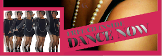
As stated previously, I have targeted an audience of young people, young people being those who are unlikely to have money, this could be negative as they are therefore less likely to buy magazines with the money they do have, yet I found a way of encouraging them. I looked at myself (as I am in the age group of my target audience) and I discovered I would be attracted to buy publications if free gifts were given away. When people are interested and love music, the majority also love dance, this can be said for the POP genre especially. Because of this, I decided my magazine will be giving away a free CD, this is encouraging users to purchase the magazine. Gifts also encourage audience to continue purchasing and have a greater impact on them subscribing to a readership.  I have used an interesting, unique image of a celebrity dancing which will also encourage my target audience into buying my music magazine.


My favourite feature
Adheres constituency successfully & targets my audience further...

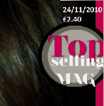
When making the magazine, I firstly created the gradient overlay effect on the writing, I was really happy with this aspect and felt it successfully  visualised my target audience. By this, I mean the way it changes from dark to light, shows a variety, which then imitates how although my magazine genre is only pop, it still appeals to a diverse stereotype. Because of this positive aspect, I went on to think of ways I could continue constituency in my music magazine by creating more diverse features and not only using gradient overlay. I tried to work with different colour fonts, overlapping one and other but this did not work as successfully as I thought. During this, I came up with the idea of making my ‘top selling magazine’ stamp with different colour circles, gradient from dark to light. This had the same diverse feel as the gradient overlay, yet it added more effect. Not only did it appeal because of the different colours used, it also imitated diversity of my target audience by smaller circles, meaning my magazine has the audience of anyone, any size. Furthermore, a positive impact would be the drop shadow behind ‘top’, not only does this emphasis the diversity in my audience, it shows society and how despite stereotypes and rejections, we are all the same.

One negative aspect is the connection between two features and the meaning behind these do not stand out. Despite this, users of magazine who feel rejected by existing magazines who use mainly males or white ethnicity, they will be attracted and see the meaning behind my gradient overlay, sizing feature and notice that my magazine has been designed and made to appeal to everyone! 

Analysis Of Front Cover.

Posting Of Music Magazine, Front Cover And Contents Page


Analysis and evaluation above!

Thursday 2 December 2010

Process, How I Overcome Difficulties And Changes Made With My Magazine Contents Page...

I followed the same procedure when making the contents page as I did with front cover. I used my flat plans and knowledge and understanding of existing magazines to help me. I had difficulties in connecting my magazine to my front cover, yet I used different colours and was able to look at them side by side, deciding which made the strongest connection. I decided on a use of grey, black and pink, colours which continued the continuous feel and also reflected and therefore would appeal to my target audience. I also used the same font, to carry out a continuous feel.

When making the front cover, I used my flat plan to add step by step features. This screen shot is a simple contents page, yet I do not want my contents page to be only simple, I want an eye-catching, visually pleasing page which will attract my target audience and more. I used basic catchy captions next to the page number, which secured easy navigation but I felt adding captions underneath would allow insight into what the magazine consisted of and thorough navigation.


Because of this I added captions. In the caption I had already used language which appeals to me and would therefore appeal to my target audience. By this, I mean, comments such as 'Oh no' this is a comment which a young person would use. The captions are also very shorts and snappy, like young people who do not use a wide vocabulary when socialising. I continued this feel of short captions with language used by target audience. Being able to make the connection  with the language used and what type of language would appeal to me was useful. When producing these short captions, I continued to look at existing magazines for inspirations. I used a grey font, a colour which I had previously used and a font which has been used on the front cove. This reinforces a continous feel which is my intention. I was happy with the structure of navigation and felt it had a positive feel, yet I felt this was let down by the big space. Because of this, I decided to add another image.


This is my final contents page. I feel it works well now I have added captions and inserted a image from my photo shoot. The subscribing of magazine successfully appeals and the discount being offered reflects the target audience as they are less likely to have money. This is only an insight into analysis of my contents page. Full analysis and annotations will be posted in a future post, keep updated.

Process, How I Overcome Difficulties And Changes Made With My Magazine Cover...

Throughout the making of my magazine cover, I followed my flat plans and inspiration from existing magazines. During the making of this, I used my Adobe Photoshop skills throughout. Firstly, I placed my masthead which I had previously made onto my new A4 Photoshop page. As previously decided, my masthead would be at the top, siding to the right, giving an pop feel, almost popping from the side. Then, I found a ideal bar code, essential for publications. I fiddled around, positioning it in different places, yet I decided to stick to my flat plan, flipped my bar code sideways and placed next to my masthead. I used inspiration from Mixmag in this part and my layering skills learnt and overlapped my bar code onto masthead, yet masthead text was still visual. Another essential aspect  for a publication is to include date and price, I then made a border for my magazine front cover allowing it to stand out. I chose the colour using colour picker as stated in previous post. I inserted my image which I had previously chosen and decided to it would take up the whole of my background as it is striking and stands out, making strong eye contact with the audience. This worked well.

Then I went on to insert my dancing image, this is where difficulties irrupted. I had already made the dancing image (step by step in previous post) yet it did not work as well as I planned. I planned for the image to be small, yet the features of shadowing was difficult to see. I used the magnetic lasso tool to take away the white background and have the image almost dancing into the background, yet this was no visually pleasing. So I added the border back and white background. I added text yet it was difficult to read, so I also added a border to this.

This is the second screen grab I took, during the process of making my publicatiton. This was when I thought I was finished, yet when analytically looking at my magazine, I found faults. I had added everything on my flat plain, yet choice of colour and font, did not in my opinion seem appealing. I felt the purple colour needed to be pink to convey a continuous feel in my magazine, like existing magazines. I also changed the brown font to pink because of this. I  felt the font of the lure did not work, it gave a more fountain pen, old feel which I believe to appeal to older generations as this is not my target audience, I decided to change it to a more young, curvy font.
After many edits because of difficulties, this is my final magazine cover. From the two images above you can see how it has been made and the changes which have been made. Analysis of this magazine publication and annotations of selected areas will be published in a future post.
 

Adobe Photoshop Skills

I have gained many schools throughout this coursework, consisting of Photoshop, Pages and many other work base medias. The media feature I used most was Photoshop, this is where I physically made my front cover and contents page. There was many different features which took time to get used to. On the left side, I have posted a screen grab of the main tool bar on Photoshop, the main features I used was the magnetic lasso tool (posted below when making my dancing image), the arrow which allowed me to rearrange images and text, text tool, the shape tool where I added shapes to become backgrounds for my images and text and the bucket which added colour to features. I found Photoshop difficult yet after spending time on it, I was able to navigate the device thoroughly. Because of this, I was able to create an ergonomically pleasing front cover and contents page.


For features which consisted of me having to choose which colour I wanted to apply to boxes, circles or text, when clicking the bucket or colour picker, this is what appeared. This feature consisted of millions of colours yet I had to decide which worked perfectly. You can see the different colours at the side, and the feature which lets you add chosen colours, for example, more red, appeared as R. When screen grabbing this, enabling users to visually see how Adobe Photoshop worked, I secured the colour picker on the colour which I have used the most in my magazine. Being stereotypically appealing to females, yet my magazine is not stereotypically and appeals to both genders, securing gender equality.


Adobe Photoshop being a working device which allows many different technical features to be added to your publication, it uses layering. This sounds easy but it is difficult when you are not used to using it. I had to gain skills in this part, learning how to duplicate and manipulate layers. Duplicating layers was essential when creating my moving image. I also used this for features such as three circles, going smaller inside each other. In doing this, I was able to create perfect circles, which the same shape then holding shift to keep the shape when making the circle smaller also ensured this. I was also able to lock layers, which allowed to me to move them when secured together. Another positive aspect was being able to hide the layer and seeing if it had a good impact, I used the eye logo to do this.


I am proud of my magazine, front cover and contents page and because of this,  I showed many friends and family members, one of the main questions they asked was how I made eye-catching effects on writing. I have decided to use the 'dance now' font to explain how I done this. I found Adobe Photoshop layer features really interesting as I was to add any effects to the writing. This particular effect I used, 'drop shadow' where I was able to change to shadowing by using an arrow on a scale, whilst doing this my font was also visual, allowing full insight into edits I was making. I felt the drop shadow added effect and almost imitates dance, as backing dancers are almost like shadows. I felt  an inner shadow also added a positive impact. Plus, gradient overlay which allowed the text to go dark to light, reinforcing diversity in my target audience. I used these effects in other texts in my publication.

Annotation of Photography. Plus, Evaluation Question 1) How my photographs represent particular social groups.

Sunday 28 November 2010

The Making Of My Dancing Image

I wanted to be different from other music press magazine, I felt this would attract a wider target audience as it is more likely to stand out. To do this, I had to work with a range of images I had prepared in my plan. I used Adobe Photoshop to create this eye-catching piece.

Here are the five images I worked from...


The making process 

Once I had the base of my images to work from I then opened my image on Adobe Photoshop, where I used the magnetic lasso tool to crop around the figure, to define the body. Once all the figure was lassoed, I copied and pasted it onto a different document. I done this for all my five images.
I then duplicated the layer in which the figure had been pasted on, and decreased the opacity. I then hid this beneath the orginal image. This acted like a shadow of the image. This could also been seen as re-enacting the music genre, as pop can be seen as loud and the shadow can be seen as echoing this. I continued this process for every image.
This is my outcome of dancing image. This was a time consuming process, yet I believe worth it. After each image had been made and duplicated, I rearranged the composition, so only a limited amount of white background was seen. I believe this image works well and emphasises my chosen music genre. The shadowing reinforces music itself and the sound. This image will have a positive impact to my music press magazine.

My Final Chosen Photographs

After following my plan and collecting intial photograph, I then went on to conduct another photo shoot, in order to re-position some of my photograph and make the outcome more successful. Here are my chosen photographs, which I will use on my music press magazine front cover and contents page.


These are my final, chosen photographs

How I Selected My Photographs..

I felt my photo shoot went well, I followed my plan which I had made and worked with my models to produce the best photographs possible. In order to carry out to ensure I used these photographs in a successful way, I kept my images organised. By this, I made a folder for my photo shoot and sub folders inside this, this ensured my images would not go missing and I was able to look at all images and choose the most successful outcome.

 This is how I selected my photographs...


I opened my document folder where I had saved both photo shoots separately. This is a screen shoot of my folder, it shows how organised I was which is a key aspect for success.


 As Nicole Mae (the main music star for my magazine) was the first photo shoot I conducted, I felt it would be good to open her folder and decide on her selected images first.


When opening folder, I was able to view all the images from her photo shoot together. This was effective as I could view the images which worked well next to the ones which didn't, recognising strong differences which I would not of been able to do if I never organised my images or took only one photograph. I looked at the images for a long time, but came to a decision...

I have circled the images which I have chosen to use on my magazine front cover and contents page. There are many reasons for these choices, which you will be updated with soon, continue reading future posts to keep updated!

I have used the same technique when selecting the images for my second photo shoot, here is the process...


I  went back onto my 'Photo Shoot For Music Magazine' folder, and then selected 'Photo Shoot 2 - Girl Band'. This is where my second photographs are kept safely.

In this photo shoot, I collected more images than the first. This was due to having enthusiastic models who were eager to take photographs, which differs from my first model. This is something I learnt. I looked through the images, making them of a larger scale where necessary and then came to a decision...

As I have mentioned above, I used the same procedure, circling my chosen images. An analysis, plus annotations of these images will be posted in future posts, don't miss out.

How I organised my photo shoot, backed up by the planning done was key to success. If I had never conducted a plan and a well organised photo shoot, my images and how I went about choosing them would not be of the high standard which I believe they are. I have visualised all my images in screen shoots above allowing viewers of my blog insight into how to conduct and choose the right images! This procedure of me selecting the right images, I believe made my front cover and contents page work.