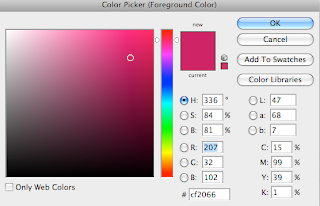
For features which consisted of me having to choose which colour I wanted to apply to boxes, circles or text, when clicking the bucket or colour picker, this is what appeared. This feature consisted of millions of colours yet I had to decide which worked perfectly. You can see the different colours at the side, and the feature which lets you add chosen colours, for example, more red, appeared as R. When screen grabbing this, enabling users to visually see how Adobe Photoshop worked, I secured the colour picker on the colour which I have used the most in my magazine. Being stereotypically appealing to females, yet my magazine is not stereotypically and appeals to both genders, securing gender equality.
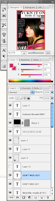
Adobe Photoshop being a working device which allows many different technical features to be added to your publication, it uses layering. This sounds easy but it is difficult when you are not used to using it. I had to gain skills in this part, learning how to duplicate and manipulate layers. Duplicating layers was essential when creating my moving image. I also used this for features such as three circles, going smaller inside each other. In doing this, I was able to create perfect circles, which the same shape then holding shift to keep the shape when making the circle smaller also ensured this. I was also able to lock layers, which allowed to me to move them when secured together. Another positive aspect was being able to hide the layer and seeing if it had a good impact, I used the eye logo to do this.

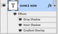
I am proud of my magazine, front cover and contents page and because of this, I showed many friends and family members, one of the main questions they asked was how I made eye-catching effects on writing. I have decided to use the 'dance now' font to explain how I done this. I found Adobe Photoshop layer features really interesting as I was to add any effects to the writing. This particular effect I used, 'drop shadow' where I was able to change to shadowing by using an arrow on a scale, whilst doing this my font was also visual, allowing full insight into edits I was making. I felt the drop shadow added effect and almost imitates dance, as backing dancers are almost like shadows. I felt an inner shadow also added a positive impact. Plus, gradient overlay which allowed the text to go dark to light, reinforcing diversity in my target audience. I used these effects in other texts in my publication.
 For features which consisted of me having to choose which colour I wanted to apply to boxes, circles or text, when clicking the bucket or colour picker, this is what appeared. This feature consisted of millions of colours yet I had to decide which worked perfectly. You can see the different colours at the side, and the feature which lets you add chosen colours, for example, more red, appeared as R. When screen grabbing this, enabling users to visually see how Adobe Photoshop worked, I secured the colour picker on the colour which I have used the most in my magazine. Being stereotypically appealing to females, yet my magazine is not stereotypically and appeals to both genders, securing gender equality.

No comments:
Post a Comment