Sunday, 28 November 2010

The Making Of My Dancing Image

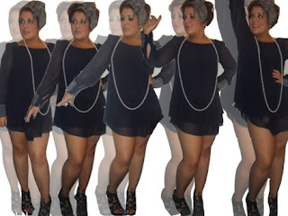
I wanted to be different from other music press magazine, I felt this would attract a wider target audience as it is more likely to stand out. To do this, I had to work with a range of images I had prepared in my plan. I used Adobe Photoshop to create this eye-catching piece.

Here are the five images I worked from...


The making process 

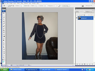
Once I had the base of my images to work from I then opened my image on Adobe Photoshop, where I used the magnetic lasso tool to crop around the figure, to define the body. Once all the figure was lassoed, I copied and pasted it onto a different document. I done this for all my five images.
I then duplicated the layer in which the figure had been pasted on, and decreased the opacity. I then hid this beneath the orginal image. This acted like a shadow of the image. This could also been seen as re-enacting the music genre, as pop can be seen as loud and the shadow can be seen as echoing this. I continued this process for every image.
This is my outcome of dancing image. This was a time consuming process, yet I believe worth it. After each image had been made and duplicated, I rearranged the composition, so only a limited amount of white background was seen. I believe this image works well and emphasises my chosen music genre. The shadowing reinforces music itself and the sound. This image will have a positive impact to my music press magazine.

My Final Chosen Photographs

After following my plan and collecting intial photograph, I then went on to conduct another photo shoot, in order to re-position some of my photograph and make the outcome more successful. Here are my chosen photographs, which I will use on my music press magazine front cover and contents page.


These are my final, chosen photographs

How I Selected My Photographs..

I felt my photo shoot went well, I followed my plan which I had made and worked with my models to produce the best photographs possible. In order to carry out to ensure I used these photographs in a successful way, I kept my images organised. By this, I made a folder for my photo shoot and sub folders inside this, this ensured my images would not go missing and I was able to look at all images and choose the most successful outcome.

 This is how I selected my photographs...


I opened my document folder where I had saved both photo shoots separately. This is a screen shoot of my folder, it shows how organised I was which is a key aspect for success.


 As Nicole Mae (the main music star for my magazine) was the first photo shoot I conducted, I felt it would be good to open her folder and decide on her selected images first.


When opening folder, I was able to view all the images from her photo shoot together. This was effective as I could view the images which worked well next to the ones which didn't, recognising strong differences which I would not of been able to do if I never organised my images or took only one photograph. I looked at the images for a long time, but came to a decision...

I have circled the images which I have chosen to use on my magazine front cover and contents page. There are many reasons for these choices, which you will be updated with soon, continue reading future posts to keep updated!

I have used the same technique when selecting the images for my second photo shoot, here is the process...


I  went back onto my 'Photo Shoot For Music Magazine' folder, and then selected 'Photo Shoot 2 - Girl Band'. This is where my second photographs are kept safely.

In this photo shoot, I collected more images than the first. This was due to having enthusiastic models who were eager to take photographs, which differs from my first model. This is something I learnt. I looked through the images, making them of a larger scale where necessary and then came to a decision...

As I have mentioned above, I used the same procedure, circling my chosen images. An analysis, plus annotations of these images will be posted in future posts, don't miss out.

How I organised my photo shoot, backed up by the planning done was key to success. If I had never conducted a plan and a well organised photo shoot, my images and how I went about choosing them would not be of the high standard which I believe they are. I have visualised all my images in screen shoots above allowing viewers of my blog insight into how to conduct and choose the right images! This procedure of me selecting the right images, I believe made my front cover and contents page work.

Thursday, 25 November 2010

Planning for Photography


When designing my front cover and contents page, I gained ideas on how I wanted my photography to look. Ideas were also gained during the prelim photography task. I decided on my front cover being a face on shot of my main celebrity in the magazine. I then wanted a small image of her and then the other images on the contents page to be of a new group. To do this successfully, I need to conduct two photo shoots.

Organisation of photo shoot
 
For my first photo shoot, this will be of my main star in my magazine. For this I will use my sister as I believe she is a young female, with a star striking face and amazing hair. These are the features of music stars which are used on real media products.

I will need to consider:
  • Costume and make-up
  • Body language
  • Facial expression
  • Background
I will conduct the photo shoot in my house, as it is a safe environment. Also in my home, I will be able to position the model and edit make-up and costume to make my photo successful. For the first set of images, I will take various close up and then decide which is my favourite at the end of the photography process. The next set of photographs, I will take a set of moving images, yet focused to portray the dance theme in my music genre. I will take these photo against a plan wall, and my models costume will change here. Differing from plain costume in the first image, which is hardly recognisable to a party wear outfit in the second image. This will appeal to the whole of my target audience.

For my second photo shoot, which will be of a new group out, with 2 artists, I will use 2 of my close friends as they are also both pretty females which are what the music industry and my target audience are attracted too.

For this, I will also need to consider:
  • Costume and make-up
  • Body language
  • Facial expression
  • Background
I will conduct this photo shoot in the school environment, as it fits in with schedules and I have a good setting in the school to work from. In this photo shoot, I will also capture many images and then choose my favourites at the end. I will use different backgrounds and foregrounds to communicate and interact with the audience.

These are the main points I will follow in my photography task.

3 Intial Mastheads and Annoatations. Plus, Ways in which my masthead develops forms and coventions of real media products.

Wednesday, 10 November 2010

Flat Plans For Front Cover and Contents Page

Front Cover Flat Plan


Contents Page Flat Plan


I decided on creating a flat plan in which was designing my magazine and contents page. I thought about all different devices other successful magazines use which I have gained knowledge and understanding from during the researching of magazine and then interpreted them for my own ideas in my own way. I feel my flat plans have given me a good base to work from now in the making process.
If I had not designed a flat plan, I would of made some mistakes when making which would have put my magazine at a low standard. For example, when looking at my contents page, I feel it may be too messy and not exact, therefore users would not be able to navigate my magazine thoroughly so when making this on Adobe Photoshop, I will make sure it is neat, which will therefore will reject limiting target audience and widen it. Also, when I was physically drawing my flat plans, I focused alot on typography and sizes, this ensured when stored in shelves, it would not be missed. I will now work from my flat plan to make my magazine and contents page successfully, reaching out to a wide yet young target audience.

Sunday, 7 November 2010

Target Audience Profile


After planning for publication and having a clear mind of my target audience, In class we  emphasised this visually through a Target Audience profile, full of images which I believe appropriate to represent my target audience.

I created this target audience profile using Photoshop, I used images from Google and manipulated layers, overlapping to show how close, yet diverse my target audience is. My intention is for my music press magazine to appeal to both genders to ensure gender equality and decrease male dominance. Because of this, I included images which would appeal to both, use of catwalk models would appeal highly to girls and football appealing to the majority of boys. I included images of current POP artist because this is the genre my magazine is focused on and therefore, conveying current artist will represent my target audience. I used logos of social networking sites, Twitter, Facebook and MSN as my magazine being aimed at young people, who are statistically proven the most likely to use these sites, this will therefore represent them. The use of social networking will also secure my target audience close together. I have clearly placed a Union Jack in the middle of my target audience profile, identifying that my magazine will appeal to the United Kingdom population, being in the middle of the page secures its efficiency. The font that I used to detail the target audience profile is a handwritten font and therefore could be seen as ideal for my target audience, it is mature but not ancient or bold. It also emphasises the appeal of both genders.

Planning for Publication

Planning for publication was a task where I planned out ideas for my music magazine on paper, in doing this, I was enabling myself to gain a clearer understanding and a wider knowledge of who exactly I am targeting, what exact genre I want to work within and what is the purpose and intention. Planning on paper, is a quick way of presenting and creating flows of ideas.


Here is my plan...


Something you can see from just looking at my plan is artistic skills and my love for typography. This will then have a big impact on viewers minds as I believe this shows style in my work which is sure to continue throughout.

Firstly, my chosen genre to work within is POP. I have noted many different ways to explore this. I will use typography, something I idolise. I have already noted some ideas of the ways in which I will do this, I will use a number of fonts, imitating the various different artist in POP genre. I will also give an upbeat feel through use of typography, which will re-enact the music genre.

Secondly, I have noted that I will include celebrity gossip as I feel this is a must in attracting audiences. I will also include reviews to provide audience with entertainment. This will educate young people about the history, media and urban scenes.

I then went on to look at gratification theory...
  • Diversion - allowing the readers to escape or release from every day pressure
  • Personal Companionship - identification with artists and socialising through discussions
  • Personal Identity - allowing readers to compare one's own life with the artist and situations presented within lyrics and music genre.
  • Surveillance - allowing insight about what is going on in the world through media.

Finally, I looked at Demographics and Psychographics. I discovered that my publication will be aimed at the London/urban area, with an audience of 14 - 24 year old, opening where necessary. It will be aimed at both genders, securing gender equality. Psychographics, I wanted to engage people who were looking to gain a wider knowledge of music genre and strictly people who were aiming to succeed.


Analysis of prelim task

I feel that my prelim task was successful in many ways; however, aspects could be improved to add an effective impact to my front cover and contents page as a whole.

The magazine school cover contains 2 images which I felt was an appropriate amount to capture and attract the target audience successfully. This ignored the disadvantage of not having any images which would give no sight and decline the audience. It also stopped over flowing of imagery which would also decline and give a negative first impression. I feel that the images were of a high quality. During the planning process, I decided on an image of the front of the school itself. On my front cover of the school magazine, I produced a low side shot which captured the graffiti, two different buildings, stairs, tree and the opening doors. The use of graffiti and different buildings emphasised diversity in the school. The stairs could be seen as showing Acland Burghley School always gets better and achieves higher. The front door opening gives a friendly, inviting feel. The second image on my front cover was of a pupil working, emphasising the hardworking, successful atmosphere the schools offers, which is echoed by the use of strap lines. If I was too reproduce these photos to achieve images of a higher quality, I would focus more on the setting and background of the shot. This is because, I felt, the second image particularly could of achieved a more effective impact. This has widened my knowledge on photography and media, which will ensure I gain a higher quality set of photos for my music magazine itself.

I decided 'ABS arts' as it I believe it is simple, but short and snappy masthead, which would achieve its purpose and attract the audience into purchasing the magazine. It is also memorable, which would widen the target audience, as pupils, teachers and parents are more likely to notify others, more than a longer, boring masthead. I used two different fonts. The font used on 'ABS' is very bold and stands out. It is quite a masculine font, giving an edgy feel. Whereas the other, 'arts' is more flowy and poetic, which can be seen as appealing to the female gender, this shows gender equality and also increases the idea of diversity in the school. I used an effect on the ‘arts’ to make it stand out and achieve the arts college status. The blue background gives the bold writing a good field to lie on, as it does not over power it and enables it to stand out fully.

I used a catchy slogan to draw in the audience, which works well as it is also memorable. This is mirrored by the use of short sentences, repetition, punctuation and rhetorical questions. All these devices are used to give brief insight which plays with the audiences mind, leaving them questioning to what’s next, which will then make them pick up the magazine and read further, widening the knowledge which is what I intend to do as part of this magazine and my music magazine.

The colours used throughout the front cover are continuous, with good control. This relates to the school system, showing all pupils are disciplined, and teachers know what they are doing and how to ensure pupils achieve top grades. However, if I was too improve this magazine, I would not use blue as it is seen as attracting males. Although the ratio in Acland Burghley School is 3:1 boys to girls, I want my magazine to attract both genders and ignore male dominance. To ensure this, I would use a colour scheme, such as yellow, because it is proven yellow attracts both gender.

I have used a range of different fonts, with different effects to make the wording stand out further. This emphasised the range of diversity of people attending Acland Burghley School and how the school itself welcomes everyone and ensures an inviting atmosphere. I feel this is a positive aspect, it gives an artistic feel, enhancing 'ABS arts' and Acland Burghley arts college status. However, looking at this through a different person’s perspective, i.e. those with limited eye sight or lower skilled, it can be a huge disadvantage as they will find it harder to read. This will alienate them and isolate certain people in the school community, making them feel unwelcome. This is an aspect, I will work on when creating my music magazine as I feel it works effectively, stands out and could fit all intention, so if I took into consideration those with difficulties, I could work with the fonts to appeal to all, and continue the diverse feel.

My contents page automatically relates with the front cover. This is a key feature which is used in all magazines; I noticed this in my research and content analysis, earlier on and carried it out on my own magazine. I will also use this feature in my music magazine. I used the same range of colour, included the logo which was a necessity and the use of different fonts. All these aspects have the same advantages and disadvantages as the content analysis. However, there are some different features. 

I used a catchy slogan, at the top of the contents page where I think will be noticed first and give an effective first impression. 'Exclusives this week only!' attracts the audience as it leaves them eagerly waiting to find out. The use of explanation mark emphasises the excitement. I think the only aspect I would change of this, would be to make the font of a larger scale.

I used curved rectangles to hold the pictures and content inside. The curving effect shows how friendly the school is. The images, despite the fact they show insight to the school, I think the viewpoints could have been focused on more which would of overall gave an effective impact. This is also a disadvantage with the images on the front cover and I have personally noticed this issue and planned to work on this aspect. In areas, it is hard to realise what the image actually is, due to the small scale so when creating my music magazine I will ensure I use clear, large images.

The use of repetition, 'keep updated! Keep updated!' reinforces the idea the magazine wants everyone to stay drawn in. The way I have placed the repetition, underneath each other, it is almost like it is being shouted and the ‘keep updated!’ in blue is an echo. This re-enacts the importance.

As a whole, I feel I have learnt from my prelim task. Features that I used and felt would have produced an effective, outstanding outcome, proved me wrong. Without a prelim task, I would have used them on my music magazine and had an unsuccessful outcome. There are aspects I will continue to use in my music magazine, however, improve in areas.

Wednesday, 3 November 2010

Posting of prelim task


Front Cover, Acland Burghley Magazine


Contents Page, Acland Burghley Magazine

Original Photography for Prelim task

This task consisted of me looking around Acland Burghley School (issue which my magazine is advertising) and taking pictures which I could then edit onto my magazine front cover and contents page to visually attract people through images. This is a feature which is used in many magazines and I will imitate successfully. When taking these photos, I had to focus on many issues. I made sure all images were taken in different locations, so students were visually aware of the inside and outside school area and therefore gained a clearer understanding and knowledge of the school area.
Here are my photographs...


This image is of the front of the school, clearly showing the Acland Burghley School logo which will welcome students, in a friendly way. The way I have captured the doors opening imitates how my magazine is persuadsive and invites students into the school itself. This image was taken from a low viewpoint which is emphasising how successful the school is that other schools (students, parents and teachers) look up to Acland Burghley. All these features in this image will succesfully advertise Acland Burghley in a positive light, attracting people into the school and magazine.


This is the second image I took, is of a hardworking student studying in a study/socialising area. This is giving insight into the whole of the school. The way the pupil is studying in an area which is used for socialising emphasises how determined Acland Burghley pupils are. This will attract people into the school and it is visualising the high grades. The student is facing away from the camera, almost showing how determined and how much studying and grades mean to her, yet the fact she is with her friends enhances socialising is also a key factor in the school environment.


My third image was captured outside of the school, emphasising the inside and outside look. I purposely captured the image when nobody was there, this holds a negative effect as it does not successful show the school or pupils itself. However, it does show where the pupils socialise and aspects of the school which are made for this purpose. The benches and grass are a nice way of pupils sitting and socialising or doing work outside of the school, this would attract pupils and parents as it is friendly way and the atmosphere, despite no pupils in photograph still manages to look inviting.


This is another outside school photograph, yet a different surrounding. When taking this photograph, I wanted a distorted feel. The way, in which benches look smaller, imitate the different ages the school goes too. In this photograph, I am showing where pupils eat for lunch and break, it is an amazing place, with curve benches and tables giving a friendly feel, this is successfully attracting people into the school as a whole, showing all positive lights.  

This image differs from the above, yet it defines the school and arts status. As the school itself is an arts school, this image visualises this status. The way in which the paintbrushes are placed in different ways, of different sizes, emphasises the diversity in the school. This photograph almost makes connections with typography; as the way letters are styled appeal to certain target audiences, the way the paintbrushes are placed here, achieve this too.


This image is also taken in the school common room, place for socialisation and study. It is successfully capturing different pupils doing differen things, differing from reading to chatting. This emphasises diversity in the school society. The way in which one student is reading enhances how determined Acland Burghley students are. However, I feel there is no focus in this image. I also believe the way students backs are faced against the camera shows students in a negative light which is something I want to reject in my photographs and therefore, I will not use it in my prelim task.

Evaluation of photography
While taking these photographs there were many features that I had to take into consideration in order to produce the perfect photo, successfully capturing the needs. One of these features were camera angel. I feel my images are successful and do show a range of diversity, however, this diverse feel could of been portrayed further if I had focused more on camera angel, making different shots. For example, if I had used more mid-shots and long-shots, differing from each other, this would of been diverse in itself, impacting on overall diversity to imitate the diversity in the school. I believe I have used the feature of lighting well; my photographs are of good quality as the light balance is clear. In areas, I have used camera focus well and in others, not so well. For example, my photograph of paintbrushes the focus is clear, whereas the photo of backs of students is not so clear.  All these features are what I have learnt and therefore will be able to produce images of a higher standing in my music press magazine.
Introduction to prelim task

This coursework requires a preliminary task. The preliminary task consists of a designed front cover of a new school magazine, which will involved the use of Adobe Photoshop. The magazine will be based on the promotion of Acland Burghley School as an Arts College school. Throughout this prelim task, I will be portraying all the aspects of Acland Burghley School and trying to appeal to a target audience.

Monday, 1 November 2010

Comparative Analysis and Evaluation of Music Press Front Cover

The two distinct music magazine front covers I am going to compare are, Mixmag and NME.


The generic music convention codes employed by the magazine Mixmag suggest the target audience are young mainly males ages, 18 – 30, widening where necessary. There are many conventions which have suggested this and I have analysed below.


Whereas, the generic music convention codes employed by the magazine NME suggest the target audience are wider males, yet still female equality, late teens, aged 16 - 25.


Mixmag and NME have both used colours in their masthead, strap line and main image to attract their target audience. They have taken into consideration typography and orientation of letters on the issue of masthead in relation their target audience. They have both used main images with strong eye contact in a way of communicating and interacting with their audience. They both over layered their images on top of their masthead to give a controlling, powerful feel which is what their target audience like and are stereotyped with. This is adhering their target audience’s stereotype. However, there are a few differences, Mixmag have used a group main image, whereas NME have just used males. Females are visual in Mixmag which therefore is more likely to appeal to a wider target audience, whereas NME are almost limiting their audience.

Mixmag use mode of address to emphasis target audience and suggest a young, inviting and friendly feel about the magazine and its readership. Mixmag have used slang like ‘run tings’ on the front cover of their magazine which appeal to young people as they use this type of language to look ‘cool’. They will look up to the Mixmag magazine and therefore being cool, which is likely to increase sales and attract a wider target audience. Whereas, NME have not used slang, just simplistic language to suggest the young generation appeal about their magazine. This is quite a interesting point, as NME I believe have a younger target audience, yet they do not use slang. This could be because there music type is less likely to be stereotyped as using slang and being in social groups which use this form of language and therefore they are representing their own social group.
Also the difference in target audience is visual when touching the physical copy of the magazine and looking at the difference in price. Mixmag is more expensive. It is glossy and solid, with a hard spine, very unlikely to fall apart. Whereas, NME is more cheap, with no feel to the paper, appealing to younger people as there are less likely to have money to buy expensive magazines.


The layout and design (including colour and font) of Mixmag contents page reflects a mood of indie/rock with a happy feel. This rejects stereotypes of rockers being emo, with low self-esteem and misery, it recognises them as being fun, enjoying life with a smile. This is emphasised in the fonts. No font suggests sadness or gives an edgy, not caring feel, this enhances rejecting of stereotypes. The font which states 'contents' gives a young, curving feel. It almost looks like a typewriter, which then relates to target audience and studying. The way everything on the page is organised gives an exciting feel and almost imitates the page itself, as it is 'contents', showing easy navigation. Only three colours are recognisable, grey, white and pink. Grey, appealing to both sexes, white emphasing purity of the magazine and pink suggesting love for the magazine. This contents page successfully gives a eye-catching feel. They have used 3 images to give insight into the magazine in all areas. NME's layout and design (including colour and font) of the contents page reflect a mood of mystery. They have used one main image. The image gives this mood through viewpoint being distorted. They have used majority of red and black which also gives this mysterious feel, and the white which is not pure white seems ghostly.

Comparatively it is clear that both magazines have different intentions, purpose and target audience yet the use the same technique and features to appeal to those. The genre, mode of adress and layout and design of the magazine suggest a mainstream audience for both magazines.

Masthead Research

After looking through various magazines, analysing front covers, contents pages and articles and particularly studying the mastheads, I went onto study further, looking at five different online sites. They all focused on different genres, varying from heavy metal to hip hop. This analysis consisted of studying the orientation of letters, colours, typography and how the magazine has used these to attract their target audience. I found my masthead research sufficiently important and beneficial as it widen my knowledge on how typography, colours and such are used and also gave me a better understanding for when designing my own music magazine, which will therefore effect the impact of the outcome of my masthead.